The best color palettes for tiny homes and STRs are rooted in warm neutrals, layered with 1–2 intentional accent colors. Think: creamy whites, soft greiges, warm taupes, earthy terracottas, and muted sage greens. These photograph cleanly, read as inviting on screen, and don't compete with natural light.
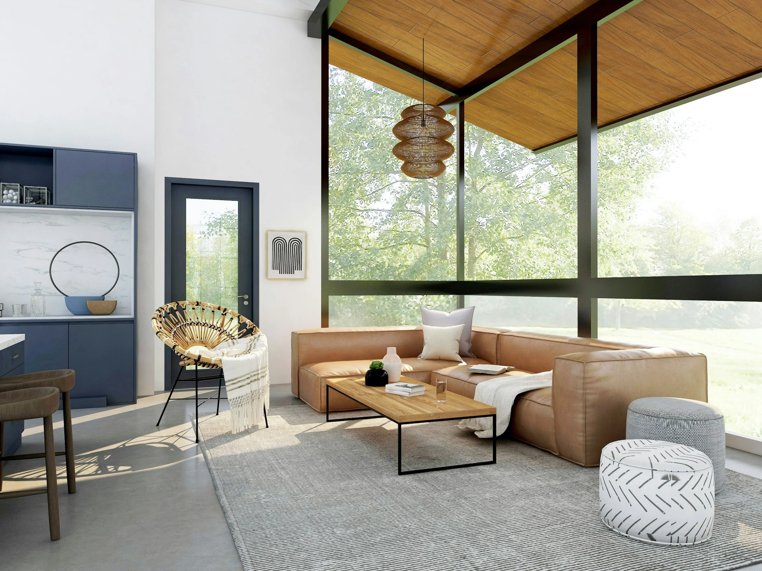
What makes a color palette "photograph beautifully" in a short-term rental?
Before we get into the actual palettes, let's talk about why this matters — because it's not just about whether you like the color. It's about how it reads in a photo taken on an iPhone at 6pm with mediocre lighting.
Here's the deal: Airbnb guests make booking decisions based on a handful of listing photos. They're not visiting your property first. They're swiping through thumbnails, and your lead photo has about three seconds to earn a click. Color is doing a lot of the heavy lifting in those three seconds.
Colors that photograph beautifully share a few traits. They have warmth — cool grays and stark whites can look clinical or flat on screen, while warm tones read as inviting, cozy, and lived-in. They're relatively muted — highly saturated colors can overwhelm a photo and pull attention away from the space itself. They have enough contrast to be interesting — an all-white space can look sterile and boring in photos; you need at least one layer of contrast to give the eye somewhere to land. And they layer well — the best palettes feel collected and cohesive without being too matchy-matchy. Apartment Therapy's research on how color affects small space photography backs this up: warm, layered palettes photograph more expansively than cool, monochromatic ones regardless of the actual room dimensions.
Keep all of that in mind as we walk through the palettes. These aren't random — they've been chosen specifically because they check every one of those boxes.
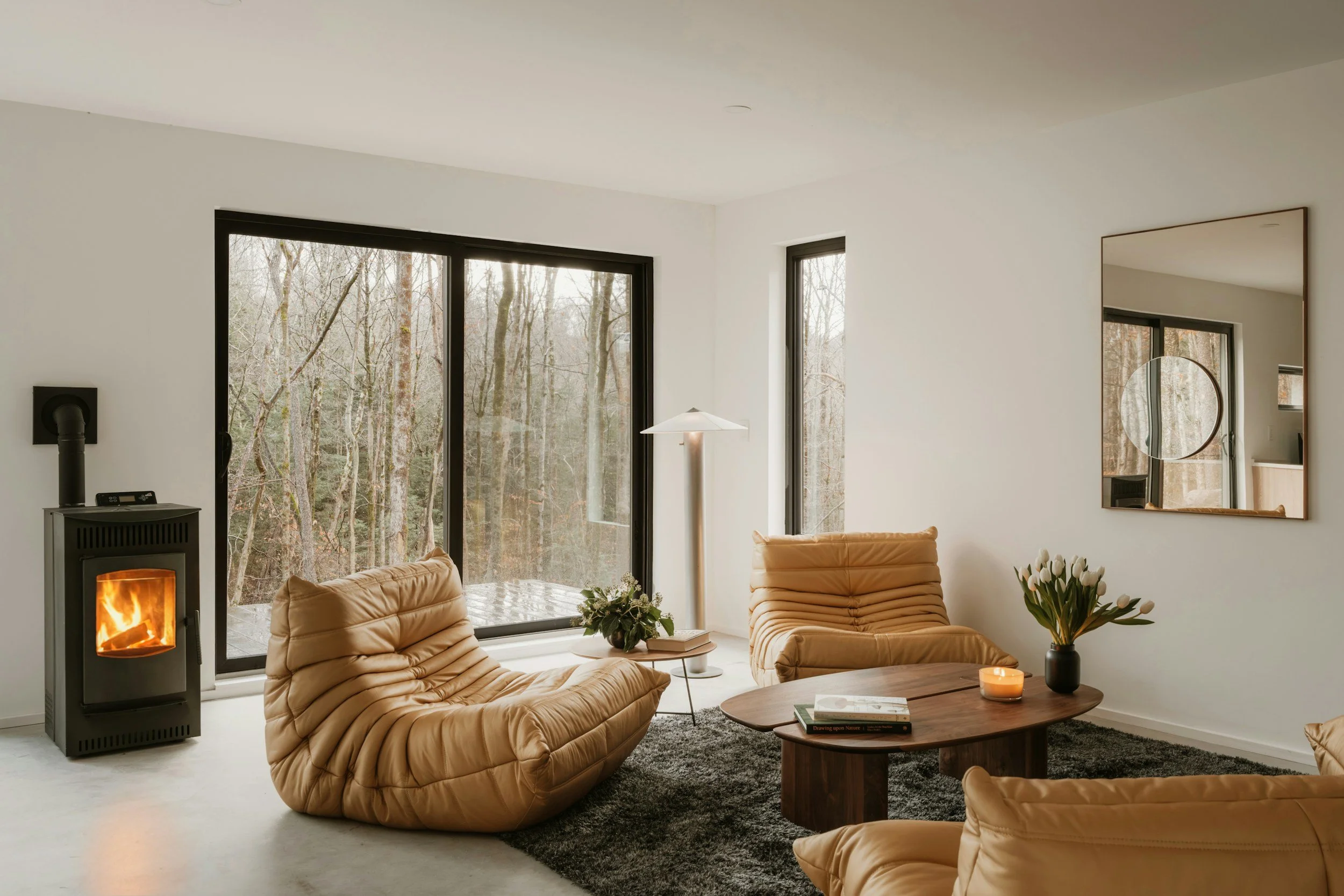
What are the best warm neutral palettes for a short-term rental?
Warm neutrals are the backbone of almost every great STR. They're versatile, they age well, they work with almost any furniture style, and — critically — they're forgiving under different lighting conditions.
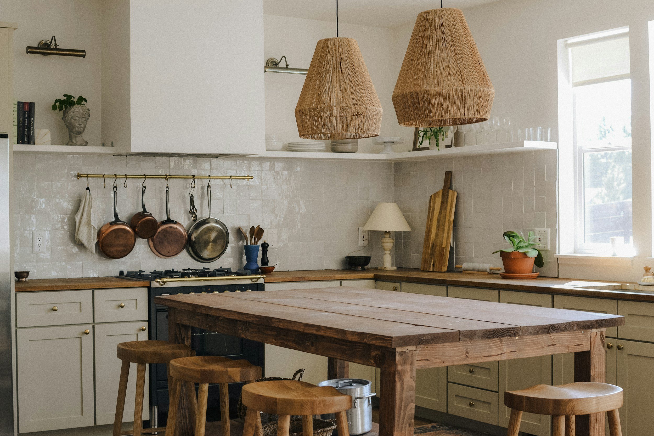
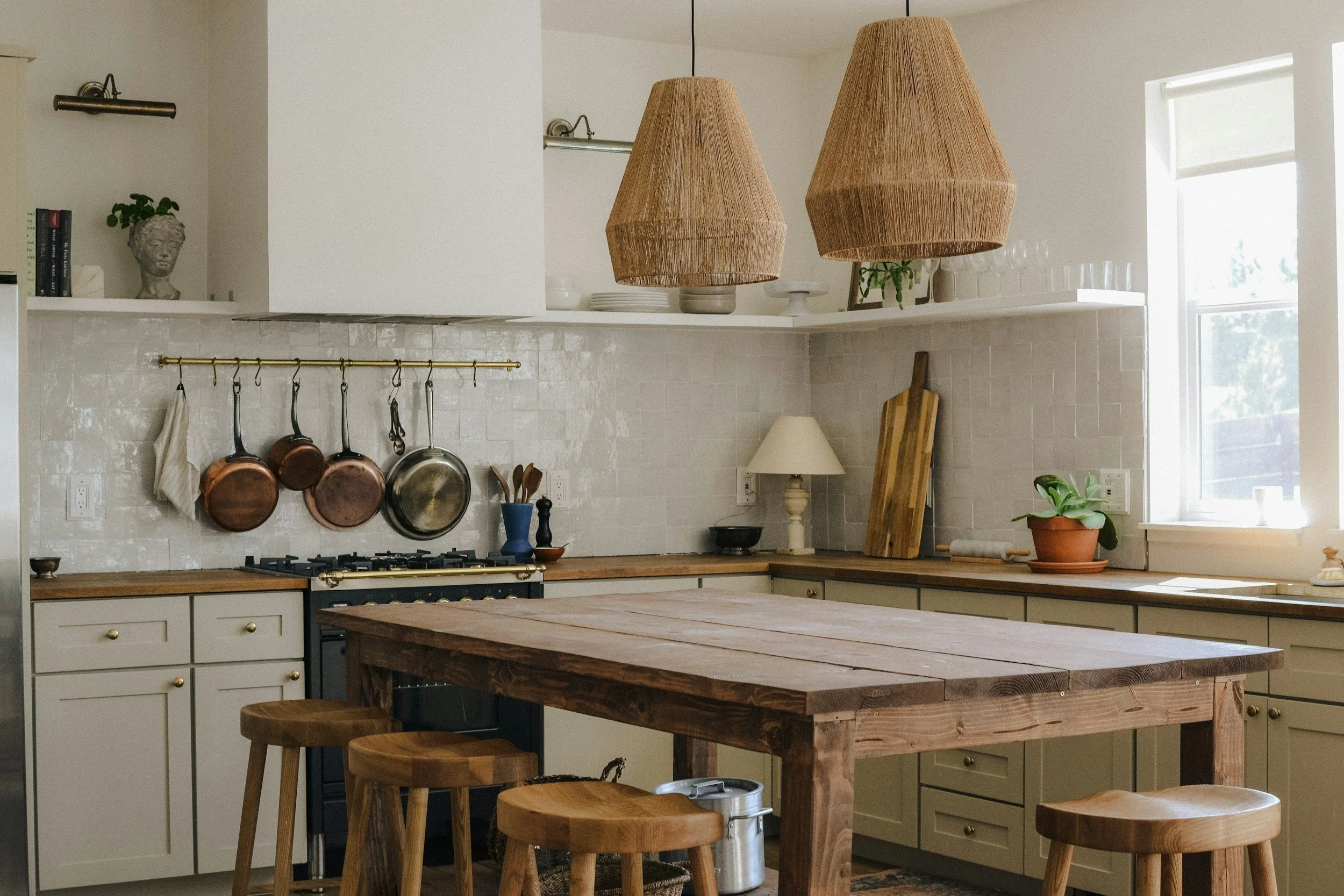
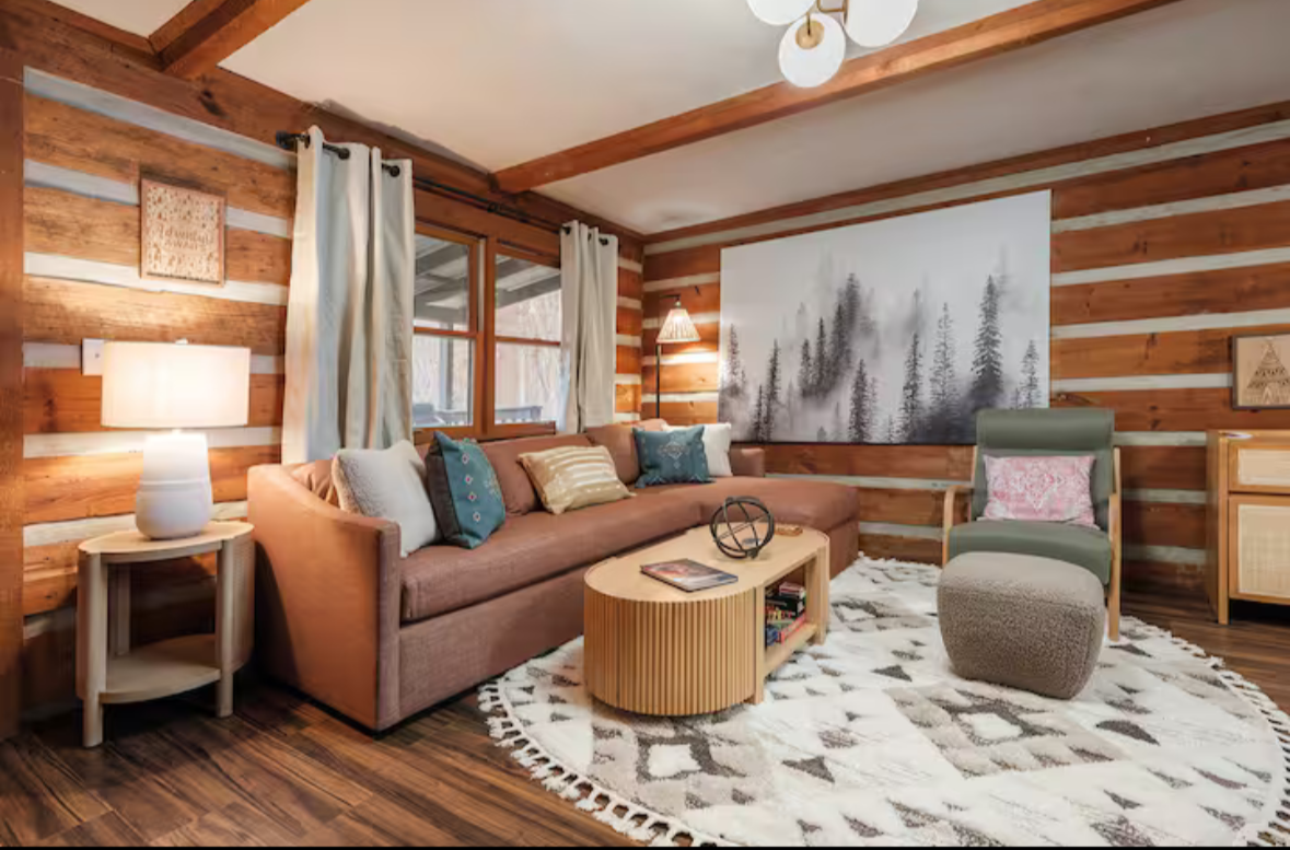
The Oat & Terracotta palette is one of the most reliably beautiful combinations for small spaces. Start with a warm off-white or oat on your walls (Benjamin Moore's White Dove or Sherwin-Williams Accessible Beige are perennial favorites), then layer in terracotta through textiles, ceramics, or a single statement chair. Ground the whole thing with warm wood tones — natural oak, walnut, or even a good wood-look tile. This palette photographs warm and golden, performs beautifully in both direct and artificial light, and feels current without being trendy.
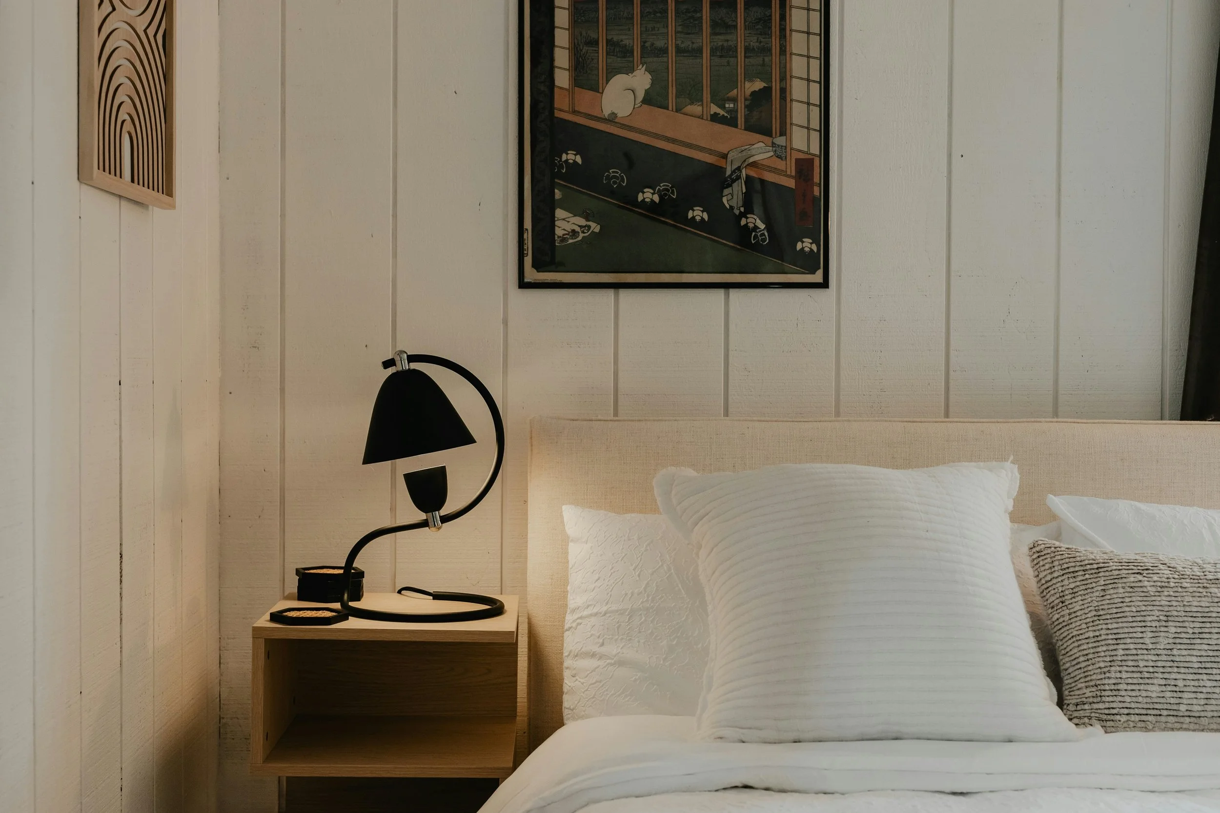
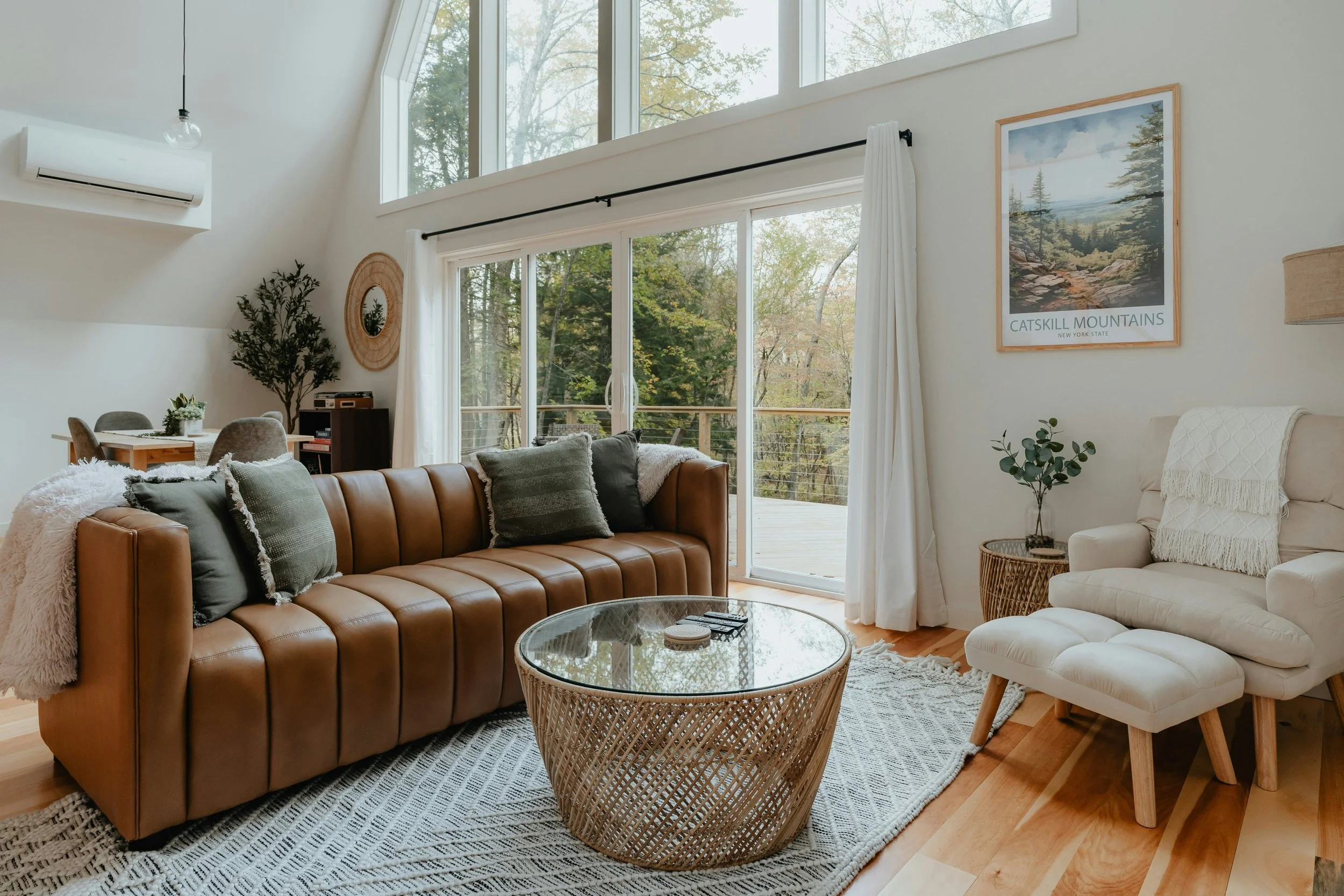
The Creamy White & Warm Greige palette is slightly more neutral but equally effective. The key here is warm — not the cold, blue-toned whites that can look harsh in photos. Pair a creamy wall color with greige accents (think linen cushions, a stone-toned rug, soft mushroom curtains), and add depth with black or dark iron hardware and light fixtures. This palette works especially well in spaces that get a lot of natural light, where it looks effortlessly bright and airy rather than washed out.
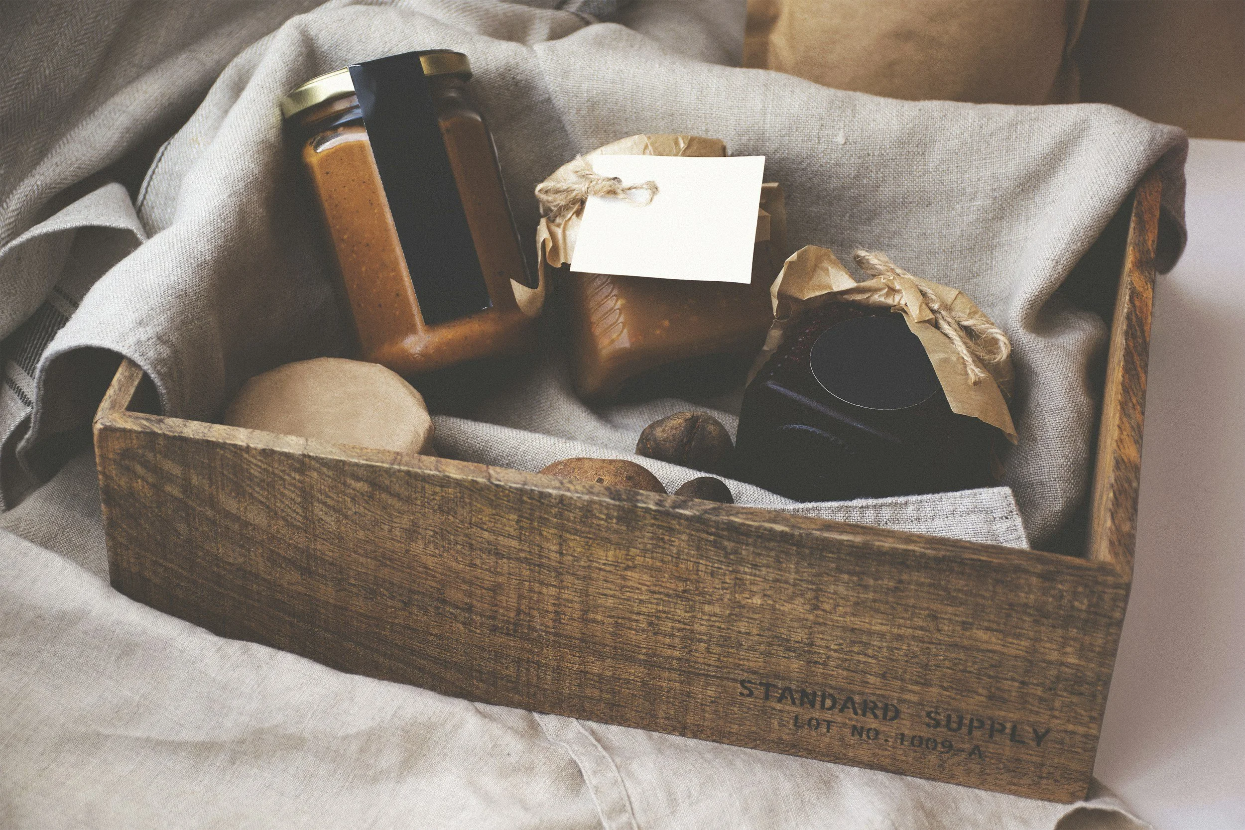
The Sand & Warm White palette is the beachy cousin — lighter than oat, more relaxed than greige. It photographs particularly well in coastal or cabin-adjacent STRs where the goal is "vacation" rather than "urban boutique hotel." Layer in natural textures — rattan, jute, linen, raw wood — and you've got a palette that reads as intentional without being overdone. Architectural Digest's coverage of warm neutral interior palettes offers useful visual references for how these tones translate across different lighting conditions.
What are the best earthy, moody palettes that still photograph well?
Not every STR needs to be light and airy. Moody, earthy palettes can be incredibly powerful — especially for mountain cabins, city lofts, or properties that are leaning into a specific aesthetic. The key is knowing how to execute them so they don't look heavy or dark in photos.
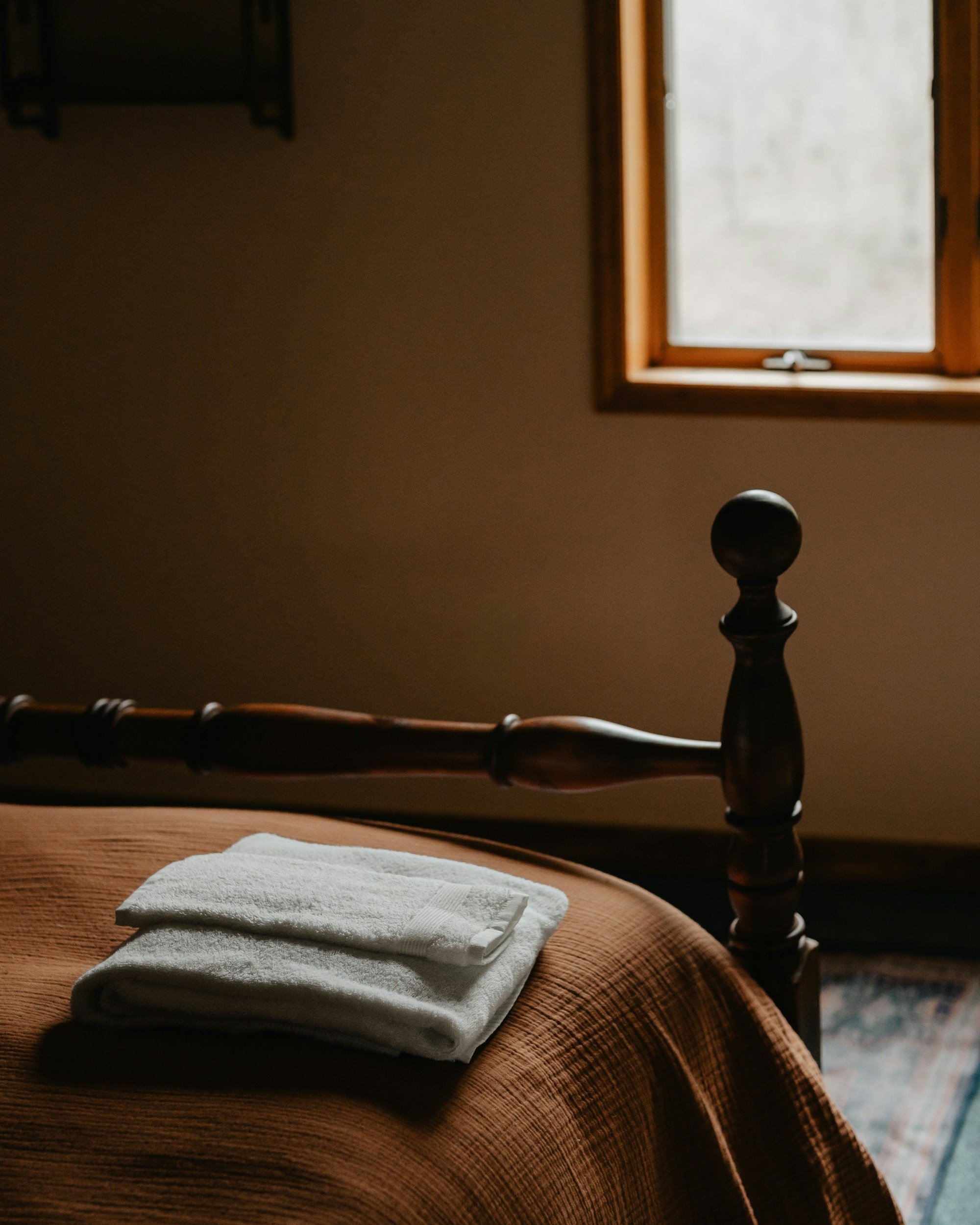
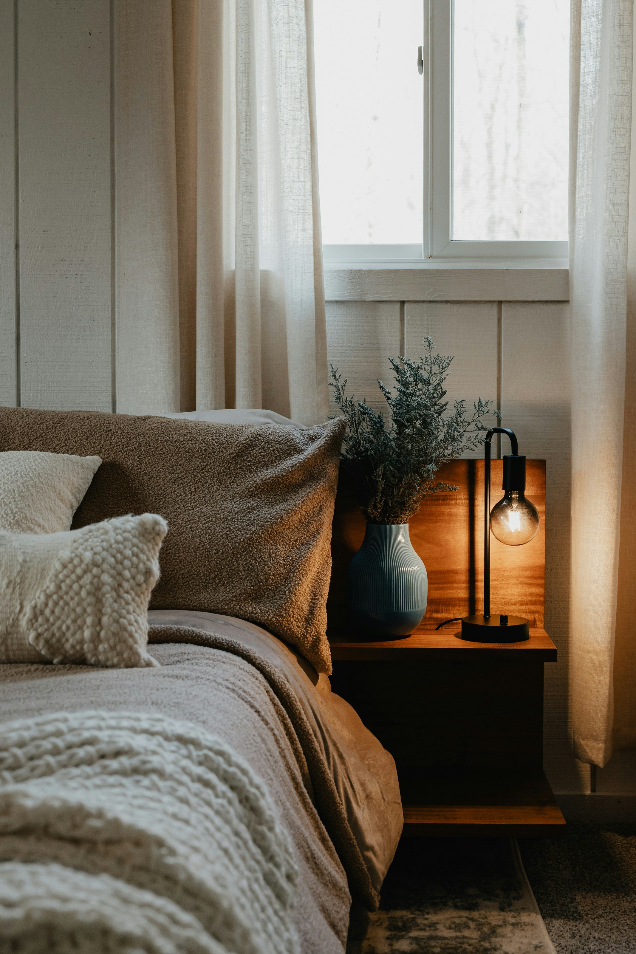
The Sage & Natural Wood palette is having a major moment right now, and for good reason — it photographs beautifully across lighting conditions. Muted sage green (avoid anything too cool or minty — you want an earthy, almost olive-adjacent sage) pairs naturally with warm wood tones, cream textiles, and aged brass or unlacquered brass hardware. This palette works in almost any space, from mountain cabins to mid-century apartments to bohemian cottages.
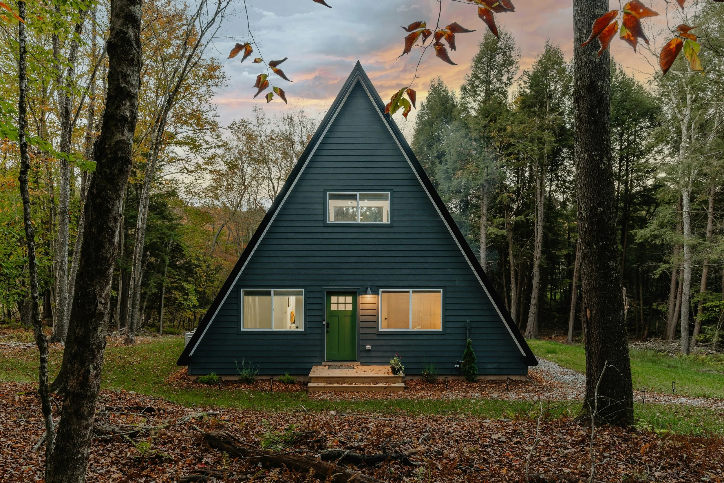
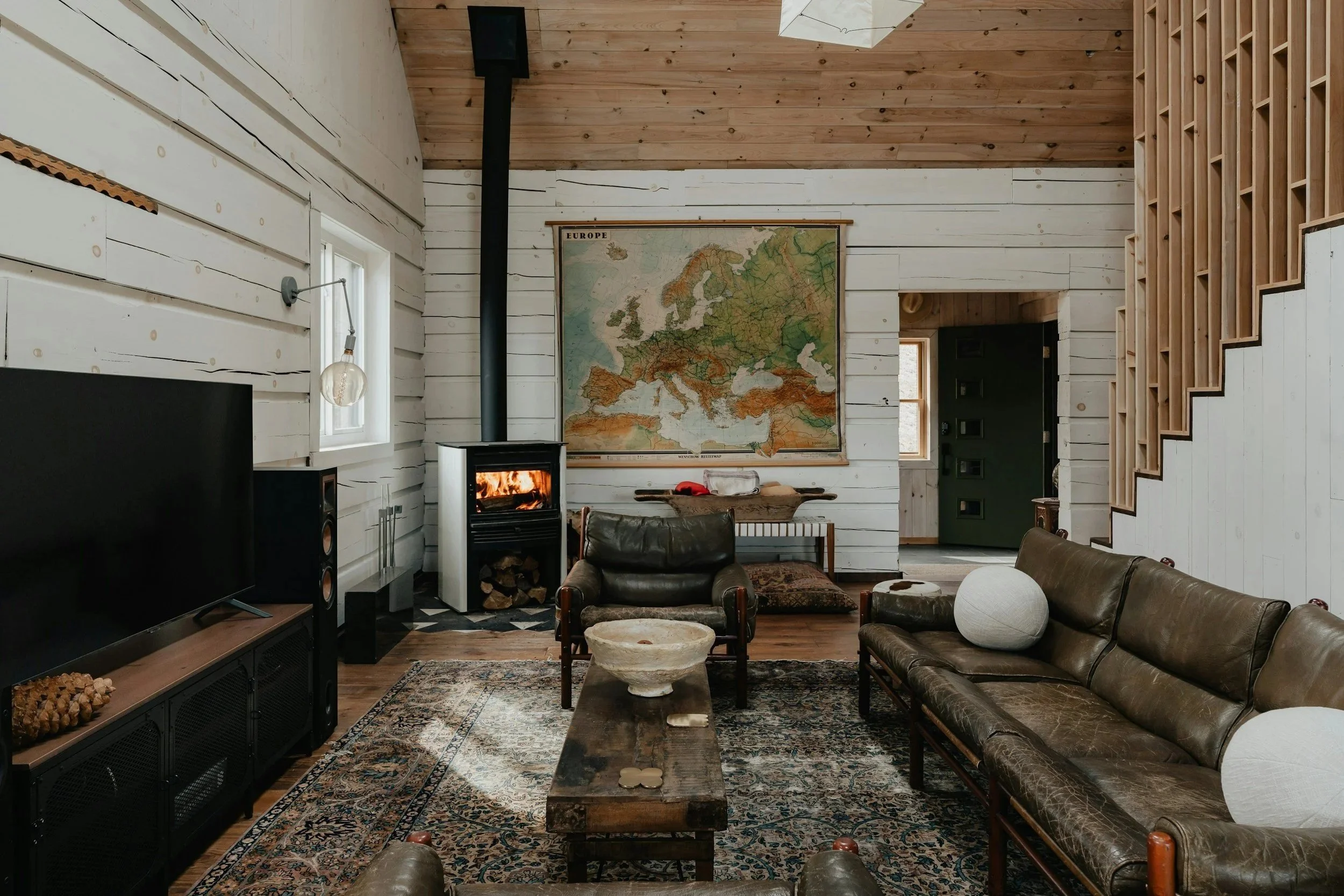
The Warm Charcoal & Cream palette is a bolder choice, but when done right, it's stunning in listing photos. Use the charcoal strategically — an accent wall, a bold sofa, dark cabinetry in a kitchen — and balance it with plenty of cream, warm white, and natural light sources. This palette photographs dramatically and tends to get a lot of "wow, I love this place" reactions in reviews.
The Clay & Rust & Sand palette is the full commitment to earthy maximalism. Every tone is warm, every layer is intentional, and the result is a space that photographs like a Moroccan riad crossed with a Santa Fe casita. This one requires more design confidence (and some restraint), but the payoff is a listing that stops the scroll. Color palette is also one of the first decisions made in Sukkha's full STR design process — getting it right upfront shapes every other decision that follows.
What colors should you absolutely avoid in a short-term rental?
This is the part nobody wants to hear, but here we are. Some colors are just a no.
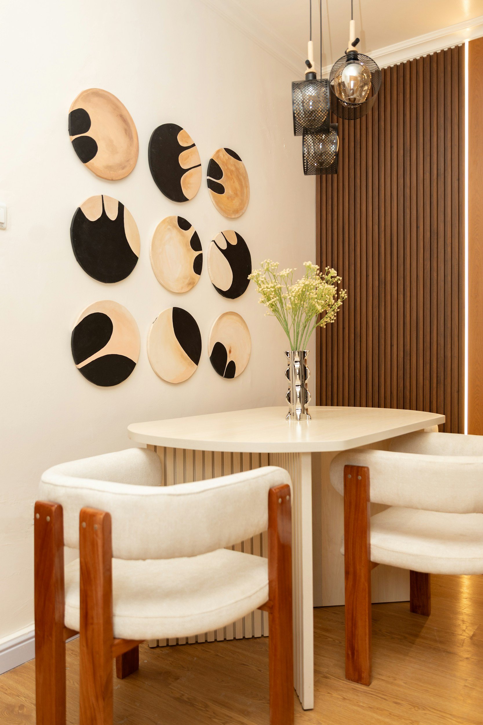
Cool grays have been on their way out in interior design for a few years now, and they're especially unforgiving in small spaces and photos. They tend to read as cold, dated, and flat on camera. If your walls are currently gray, a repaint is one of the highest-ROI updates you can make. The Spruce's guide to paint colors that photograph well makes the case for warm over cool with specific before-and-after examples.
Overly bright whites (anything with a blue or green undertone) can look clinical and harsh in photos, especially if your space doesn't get abundant natural light. If you want white walls, go warm.
Highly saturated statement colors on large surfaces tend to feel polarizing and can make your space feel smaller in photos. Save the saturated color for small doses — a single piece of art, a throw pillow, a lamp.
Uncoordinated multi-color schemes — beige walls, burgundy furniture, green curtains, and a blue rug don't add up to "eclectic." They add up to "hard to book."
How do you choose an accent color that works with your main palette?
Here's the simplest rule: pick one or two accent colors, and then repeat them throughout the space in small doses. A terracotta throw pillow, a terracotta ceramic vase, a terracotta-toned piece of art. The repetition is what makes a space feel designed rather than decorated.
Your accent color should be a shade or two deeper than your main palette, or it should introduce a complementary warm tone. In practical terms: warm neutrals pair with terracotta, rust, aged brass, and warm navy. Sage green pairs with cream, warm wood, aged brass, and burnt orange. Charcoal pairs with cream, warm white, natural linen, and gold.
The goal is cohesion, not uniformity. You want the space to tell a visual story where every element feels like it belongs in the same chapter. When the palette is right, the photography follows naturally — and great photography is what converts browsers into bookers and drives real ADR gains. House Beautiful's color combination guides are a useful visual reference for seeing how specific accent pairings play out in real spaces before committing to a palette direction.
Frequently Asked Questions
What is the most popular color palette for Airbnb listings right now?
Warm neutrals — particularly oat, creamy white, and warm greige — are consistently the most popular and most effective for STR listings. They're versatile, photograph well, and appeal to a broad range of guests.
Does wall color really affect Airbnb bookings?
It does — indirectly. Wall color affects how your listing photos look, and listing photos are the primary driver of first impressions and click-through rates on Airbnb. A fresh coat of the right color can meaningfully improve how your space reads online.
What's the best white paint for a short-term rental?
Benjamin Moore's White Dove (OC-17) and Sherwin-Williams Alabaster (SW 7008) are both excellent warm whites that photograph beautifully. Avoid anything with a blue or green undertone — they read as cold and clinical in listing photos.
Can I use dark colors in a small STR?
Yes — strategically. A single dark accent wall in a small space can actually make the room feel more intentional and dramatic rather than small. The key is balancing dark tones with plenty of warm light and lighter elements.
How many colors should a short-term rental have?
A good rule of thumb is 60/30/10: 60% dominant color (walls and large furniture), 30% secondary color (rugs, curtains, secondary furniture), and 10% accent color (pillows, art, decor objects).
Do I need to repaint my whole STR to improve the photos?
Not necessarily. Sometimes the biggest photo improvements come from adding warm light bulbs, introducing textured layering, and swapping out a few key decor pieces. But if your walls are cool gray or stark white, a repaint to a warm neutral is one of the highest-ROI updates you can make — and it's often less disruptive than hosts expect.
Not sure which direction to take your STR's color palette? At Sukkha Interior Design, we design tiny homes and short-term rentals that photograph beautifully, book reliably, and earn the reviews that bring guests back. Book a consult and let's nail your color story.

If you are looking to transform your space, interested in Asheville real estate, or just want to say hi, I'd love to connect!
Not quite ready for a full on design project? Take a step towards transformation with the 30 Minute Home Refresh Guide.
READ MORE
Let’s Connect